Wilson Library is one of my least favorite places to study on campus, yet one of my most favorite place to conduct study. By conducting study, I specifically mean searching through archival material found within the North Carolina and Southern Historical collection. In ENGL 123, we visited the reading room to observe archival material for Robinson Crusoe, Sherlock Holmes, Frankenstein and Jane Eyre. It’s interesting what we observed, from comic books to playbills. The latter was something that caught my interest as I’m a dramatist so it’s attractive in how theatre advertisements show things. The Jane Eyre Playbill was the first artifact I examined. It’s long letters were the first thing that caught my eye. Interestingly enough, the main actresses name was larger than that of the character she played or play name. It’s a technique used by companies when promoting an upcoming motion picture. An “Academy Award-Winning” by an actor/actresses name does the trick in laying legitimacy to a portrayal. At the time of this production, she must’ve been well renown for previous works. Thus, it makes it a big deal that she’s playing Jane instead of vice versa. Seems a bit narcissistic but keep it noted. Underneath the characters names are how each scene is divided up into acts. There’s references to what occurs in each section. As a person who’s watch the film for class, I know what to expect. Someone coming in who isn’t familiar would be questioning the references. What’s traditional about this is the audience of the early ages came into performances with anticipation in acts for what to look out for. I expect that this performance does the same due justice in having no surprises. But with adaptations, there’s always room for a few adjustments. For example, a few years ago Playmakers Repertory Company put on a rendition of Sweeney Todd. But I can recall the big hoopla being the protagonist was portrayed as black. The same goes for the new Company Carolina play “Godspell” where the campus newspaper, the Daily Tar Heel, highlighted that Jesus was being played by a black women. These colorblind roles can be confusing but as long as the same messages are conveyed, the original story stays intact. Looking at the playbill as an object, it’s very fragile. So weak that its wrapped in plastic and we aren’t allowed to lift it up. The fabric of the material shows its age in its yellow spots and brown paper. It’s important that Wilson preserves this kind of material so it isn’t destroyed. Other objects around the room have similar conditions. One book for Robinson Crusoe is so fragile that the pages had to be lifted by two hands. The book copy of Frankenstein is so sensitive, we couldn’t open it up for a read. That’s why its vital that these materials are taken good care of as they contain great information, but in a not so great condition. Glad to see to see the first-years in the class exposed to an excellent resource on campus. It won’t be the last time them or I come here.
Third Blog Post: Wilson Library Visit by Miller Kittrell
On October 23, our class visited the Wilson Library and had the opportunity to observe several of the original and special editions of Robinson Crusoe, Jane Eyre, Frankenstein, and Sherlock Holmes. In our viewing time, my group made an effort to look at one book in each section and understand the different ways in which the literature we have read in class has been presented in the past. One piece that caught my eye was the poster for the Jane Eyre theater production. Today, plays are not as common as movies, and viewing a form of advertisement such as the Jane Eyre piece is uncommon. Upon inspecting the artifacts, we considered the several marketing techniques, such as the font sizes and the lack of focus on the story itself, used by the creator, to determine what we found in the poster to be successful.
First, I want to reflect on how the sign endorses the story of the book Jane Eyre. In 1872, it was probable that a majority of people attending the play, would not have read the book and therefore, would not know the story of Jane Eyre. Because of this, it would be necessary to include a brief summary of the story on the sign. When you look carefully over the placard you see the powerful, one-word descriptions, such as “LOVE” and “FEAR,” for each act. The purpose of these is to grab the attention of the viewer and create a desire to watch the production. We agreed that the word selection was very persuading and would most likely have successfully drawn people to view the production.
The second aspect that stood out is about how the poster markets the performance. Immediately upon taking a glance at the poster, you noticed the big names followed by words so small you cannot even read them without looking closer. This technique is very common on many ads, papers, and advertisements to get the reader to focus on main ideas without worrying about the lesser details. What made the Jane Eyre poster different from what our group was most familiar with was the fact that it bounced from one font size to another; large, to small, to medium, etc. When discussing as a class, we determined that the purpose is still the same as when other creators use different font sizes, but the designer for this poster, was very creative in her way of shouting out what they found important. One of which was the name of the actor portraying Jane Eyre, Maggie Mitchell. On this particular theater poster, the actor’s name was printed in a larger print than the title, which led us to believe that the play likely was not viewed by large numbers of people. By enlarging Ms. Mitchell’s name, who was a famous actor and in her last couple performances as Jane, the marking contributors used the technique to bring in more people to watch the show.
Due mainly to the fact that theater posters are far less common than they were in the time period this was created, it made the work fascinating to view. Focusing primarily on how it was used to market the play, our group determined that it was likely a successful work of advertisement as its font sizes captured your attention and brought you to recognize the lead character was to be portrayed by a popular artist. We also felt that by giving detail about the acts of the play without giving a summary was also a good contributor when trying to attract a wide range of spectators. By the several different components of the piece we assumed the turnout to be a very successful one.
Blog Post #2 Wilson Library
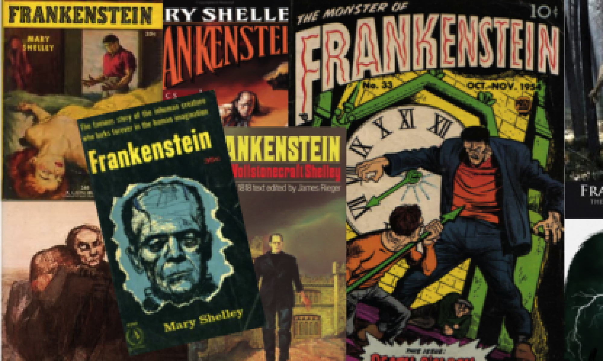
Initially, before our class went to Wilson library I did not think that I was going to be as intrigued by this visit as I ended up being. The first book that I observed in the collection was the paperback version of Frankenstein published in 1983. What drew me to this particular book was the brightly colored cover that showed a large graphic of a women lying on a bed and the creature standing in the background. The striking use of yellows and reds in this image quickly draws a reader’s eyes to this edition of Frankenstein as opposed to the more neutral colored editions also present in the collection. However, the image on the cover of this book confused me because I feel as though it doesn’t represent the story of Frankenstein very well.
The main focus in the cover is of a woman lying on a bed with a lot of her chest exposed. If this was the first image I saw to represent the story of Frankenstein I would expect the story to be a romantic one.The Mary Shelly’s 1818 version of Frankenstein was definitely not a romance. The most prominent relationship shown in this book was that of Elizabeth and Victor, but the story focused much more on the creature’s feelings rather than those between Elizabeth and Victor. Therefore, it would make more sense if the creature was the main focus on the cover, rather than in the background of image on the book. Elizabeth and Victor’s relationship was also not very romantic. In the beginning of the book when Elizabeth enters Victor’s family there is always an expectation from Victor’s mother that they will marry, but once Victor goes to school and begins his work on the monster he completely ignores Elizabeth as well as all the other people in his life. It comes to the point that Elizabeth has to send letters to Victor practically begging him to write the family back and update her on his sickness. When Victor falls ill again towards the end of the book Elizabeth asks him if he is in love with another woman, and Victor has to assure her that he is not.
Another reason that the book cover focusing on the woman doesn’t make sense to me is because women were not represented well in Frankenstein. Elizabeth is the woman that gets the most detail written about her in the book, but it is a very small selection of the book compared to the vast amount on Victor and the creature. The way women are treated by the other characters in Frankenstein also leads to their poor representation. Aside from Victor’s lack of attention for Elizabeth, it is also shown through the trial scene that the rest of the town does not give women much validation. When Justine is falsely accused of murdering William she attempts to defend herself, but, realizing her voice is useless, she simply gives up and confesses to the crime. Elizabeth is also helpless in her ability to convince the town to stop Justine’s execution. The male, Victor, is the only person with the power to stop Justine’s execution since he would be believed if he chose to explain the situation. This scene exemplifies the passive role women play in the novel, so choosing a male on the cover of the book would make more sense.
Wilson Library Visit
As a class, we had visited Wilson Library. The different materials that we were able to look over showed how stories such as that of Frankenstein, Robinson Crusoe, Sherlock Holmes, and Jane Eyre were repurposed over time. One of the materials that I looked at was a comic book adaptation of the classic Sherlock Holmes story, The Hound of Baskervilles. What I found to be pretty interesting, was a page of the comic in which a group of suspects was laid out, through photos and description of each them. This gave an interactive element to the text so that the reader felt as they were more involved in the search for the criminal. I am not entirely familiar with the original source material, but what I do know is that this particular story is not very action-packed. But the comic book gave off a very different impression, as the first image of the comic book shows Sherlock Holmes punching somebody, which is a particularly violent image for a detective known for his deductive reasoning rather than his fighting prowess. There is also another image within the comic book that shows Sherlock holding a gun. Which got me to thinking about how this adaptation of The Hound of Baskervilles could be adhering to the action-packed format that is synonymous to that of a comic book. A comic book warrants spectacle, which is what this particular story could have originally been lacking, so it may have been essential to the authors to make the story seem more exciting by inserting more violence. The changing of Sherlock Holmes’ character reminded me of the movie adaptation of Sherlock Holmes in 2009, in which they turned Sherlock Holmes into an action hero. The movie was filled to the brim with different action set pieces and it seemed as if the greatest commonality between the characters in movies and characters that were based on in the book, were their names. The movie was also incredibly stylized and fast-paced, which is a staple of Guy Richie’s film-making. It’s definitely interesting to see how people take the original source material and how they try to make it their own, but then in certain aspects, it seems like these stories are repurposed completely based off the brand associated with its namesake. There comes a certain point in which an adaptation deviates so much from its original source that it brings up the question of why didn’t a particular author or film-maker, just take their own story. Making a comic book or film about a classic story, can definitely work in one’s favor if an interesting take is brought to the table, but when it seems like elements of a story are used just for the reason that they are recognizable to a general audience, that is when adaptations seem unnecessary. But yet, I digress because I did not read all of the comic books, so regardless of the vivid imagery that I saw in the comic book, it Is possible that these first few images were utilized as a sort of framing to give the audience an expectation that the story will be exciting and fast-paced. This idea of framing was also very apparent in one of the other materials that I came across during our library visit which was the series of reviews regarding Jane Eyre. All the reviews talked about how fantastic Jane Eyre was, calling it one of the most exciting novels to be put to pen and paper. These reviews prime the reader to have lofty expectations of the novel, which could work to its detriment, in that readers could be disappointed in the quality of the writing, or to its benefit if readers forgive the shortcomings of the novel because they think that the book is “a classic”. It is evocative of somebody reading reviews on Rotten Tomatoes and believing that a film will be good, just off the fact that it has a good rating on the somewhat credible site. I found these two materials during my Wilson Library visit to be the most interesting to me, in that they brought up the discussion of why adaptation exist, how can people repurpose stories in an effectual manner, as well as the idea of priming and how exactly it interacts with a reader.
Wilson Library Reflection
A recent visit to the Wilson Library’s special collections -specifically to study pieces concerning Frankenstein, Robinson Crusoe, Sherlock Holmes, and Jane Eyre– has brought forth the importance of visual and material elements in the perception of media. These are meant to lend a certain notion of the content inside to the reader as soon as they pick up a work, before they can even begin to read the words. When viewing the pieces at Wilson Library, the most heavily discussed and prevalent elements included cover designs, illustrations, and binding/printing materials.
In particular, the Robinson Crusoe collection had a variety of different designs and editions, most of which relied on the addition of illustrations either printed along with the story or drawn in by other readers. For instance, one edition examined, The farther adventures of Robinson Crusoe; being the second and last part of his life, : and of the strange surprizing accounts of his travels round three parts of the globe. Written by himself. ; To which is added a map of the world, in which is delineated the voyages of Robinson Crusoe, featured a map of Crusoe’s voyages. Fictional writers often choose to include maps in order to add a sense of legitimacy or to immerse the reader more fully in the story of a fantasy world. In this case, the author’s reason probably aligns with the former. Another reason could be that the map may show particular geography that justifies decisions that Crusoe makes while on the island. The life and adventures of Robinson Crusoe of York, mariner : with an account of his travels round three parts of the globe written by himself was a version that had belonged to George Cruikshank, with his hand-drawn illustrations inside the front cover and inside title page. The binding itself was relatively cheap: cardboard cover and small size. However, the drawings of Friday dancing and Crusoe add some interest and leave the reader with impressions of Cruikshank’s own interpretation/vision of the events occurring in the novel.
Yet another Crusoe example, The adventures of Robinson Crusoe
by Daniel De Foe ; embellished with numerous engravings, after designs by J.J. Grandville, John Proctor, and others, sets an entirely different expectation of the novel due to its design and illustrations. On the surface, the pages of this edition read more like a storybook with elaborate borders on every page and many images scattered throughout. In this way, a reader may be less likely to take Crusoe’s story as a real one as Defoe tries to emphasize in other versions of Robinson Crusoe.
As observed at the library, authors and publishers make very specific decisions regarding the use of visual or material elements to achieve a certain purpose, whether it is appealing to different types of audiences or intentionally misleading readers. After examining the various editions available in the special collections, determining the intended impacts of visual aspects of a piece of literature or other media will be much easier and more meaningful as the experience has highlighted the importance of the distinctions made and how they can affect the audience mindset.
“The Devil’s Brood”: Wilson Library visit
At Wilson Library, we looked at a few different adaptations of Frankenstein. One particular adaptation that stuck out to me was a book titled “The Devil’s Brood: The New Adventures of Dracula, Frankenstein & the Universal Monsters” by David Jacobs. This book takes the iconic character of Frankenstein’s creature and uses it, along with other Universal “monsters,” to create a horror story. While I didn’t read the book, by looking at the front cover, the synopsis on the back cover (which is also used in the accompanying letter), and the other two books in the Universal Monsters trilogy, I was able to learn a lot about this Frankenstein adaptation.
The cover of the book clearly identifies what type of adaptation this novel is. Dark purple skies, an eerie full moon, spooky green fog, and four classic monsters give the cover a typical horror-story feel. Of the four monsters, there is a mummy with raised arms, the Wolf Man crouching on a bridge, classic Dracula with a long purple cloak, and the 1931 Frankenstein’s Monster with green skin and neck bolts. The Scooby-Doo like cover not only tells the reader that this novel is a horror story, but also makes me believe it is geared more towards younger readers, perhaps teens and young adults. Besides the title, there are two tag lines on the front cover: “Fear is Universal” and “A new novel of classic terror based on the Universal Monsters.” These two lines reinforce the book’s horror genre and identify the author’s intent of writing a new story utilizing characters that the readers are already familiar with. One specifically interesting thing about the title is that the creature is named “Frankenstein,” like it is often mistakenly done in pop culture, while in the original novel, Victor Frankenstein is the author that creates the unnamed monster.
The synopsis on the back of the book, which is also used in the publisher letter we saw at Wilson Library, tells a little bit about the storyline. As I suspected based on the book’s cover, Frankenstein’s monster, along with other classic monsters, are evil creatures that have “reawakened to torment the world.” We also learn by reading the synopsis that the protagonist is an American gangster.
By some of the phrasing in the synopsis, such as “reawakened” and “return,” made me wonder if this book was a part of a series. After a little research, I discovered that “The Devil’s Brood” is the second book in a trilogy based on classic Universal monsters. The first book, written by Jeff Rovin, is named “Return of the Wolfman,” and the third book is “The Devil’s Night” and was also written by David Jacobs. My guess is that Universal wanted to create new profitable material (without necessarily having to invest in new characters and stories) and hired different authors to create popular stories based on existing classic characters.
This novel was intriguing to me because it looks exactly like what I would expect from a Frankenstein adaptation. Although, after reading the 1818 book, I now realize that the popular 1931 movie version of Frankenstein is not as true to the original as I initially thought. However, as a young reader, I could definitely see myself reading this book and I’m sure it would have influenced the way I approached the character of Frankenstein’s creature.
The Last Harry Potter Movie, Part 1 of 2….and Other Authorial “Lies” (Jillian Ward)
It is certainly uncanny the number of ways in which authors, producers, and directors alike will seek to increase their profits, but is it always foul play? The copy of Jane Eyre – or, as it turns out, the copies – present in UNC’s Wilson Library would entice you to think otherwise.
Jane Eyre was originally published in October of 1847, in three volumes, each appearing to end in a “cliff-hanger” of sorts. You might expect, coming across this format which is so unlike the structure of a novel in the modern-day, that this is merely a way to trick people into spending more money for three, separate, physical copies than they would for one and one, alone; however, I would suggest that, in fact, this structure very closely resembles the way we consume stories today, and the decision to split up a narrative into multiple parts — or to refrain from doing so — is directly correlated to the time period in which that narrative is consumed.
Jane Eyre, first and foremost, is a long story, containing many events; pieces of background; and intense, thorough, and important character development. It also fell quite perfectly into the literary landscape of the 19th century: sweeping romances riddled with personal, social, and emotional difficulties but who ultimately end up together through the depth and breadth of their love for one another. It is unsurprising, then, that Jane Eyre would grow to be widely purchased and widely proclaimed a “great classic novel,” among other lofty convictions.
The format of the 1847 edition of Jane Eyre is also unsurprising; it was the typical format in which women would purchase their novels. If your goal was to appeal to 19th century women, a three-volume-novel would be the best way to do it. It would be risky even for a story like Jane Eyre to break the shelves in a bold and un-bespoke single volume.
So, of course, it can be said that the decision to publish Jane Eyre in three volumes is highly unlike the decision to break the last Harry Potter movie into two parts; one might suggest that Harry Potter was broken into two parts because of corporate greed, and I wouldn’t correct you, but what if there was another plausible, cultural explanation?
We see from Jane Eyre that our expectations of how a narrative will be formatted can be a factor in whether or not we pay money for that narrative experience. When you sit down to watch a TV show, you don’t expect to watch a 2-hour episode, right? Of course not: 30 minutes to an hour is the usual, expected range. However, many people will happily sit down to watch a 2-hour “movie.” And why is that? Because we have different expectations as to the format of a movie and a TV show. And these expectations of the structure of a narrative lead us to feel a certain way about that experience.
The frustration some felt with the corporate decision to split the last Harry Potter movie is closely tied to the experience of sitting through a 2-hour episode; we feel irritated that our expectations of that format have been disrupted.
If Jane Eyre had been published as a one-volume-novel, it may have completely turned off some readers who would have otherwise enjoyed her story. And aren’t there readers in the modern day who prefer trilogies of three books, 300 pages each, and who would drop their jaws at the prospect of purchasing a 900-page novel?
And on that note, who in their right mind would pull up to the theater to watch a 4-hour-long movie?
Appealing to the expectations of your audience and to the different cultural dynamics in play makes money, honey. But it also makes sure your story makes it past the shelves in the first place.
Wilson Library Experience
In my opinion, our trip to Wilson Library was well worth the time. Throughout my high school career, I was never introduced to the complex ways in which a book is made. Of course I knew the basics, but I did not think about why the particular fonts and bindings were chosen by the author for each book. It was very interesting to learn about the various books and materials that were on display, and to understand why they are so important and still learned about today.
My group was able to look at three books that we thought were appealing. Out of the ones we looked at, my favorite was Frankenstein, the Paperback 472 version. The first question we answered about the book asked about how the front and back covers of the book represented Frankenstein visually and textually. As I compared the cover of this version of the text to the one we just finished in class, I realized how much more intriguing this book appeared. The cover showed the part of the story where the Monster kills Elizabeth and she is sprawled out on the bed. In the background of the cover, the Monster was looking down at his hands with an expression that made it look like he was sorry for what he had done. This graphic could make people view the Monster differently before reading the book. As we read the 1918 version of Frankenstein in class, I understood it as that the Monster was not at all sorry for killing the people Victor loved. From looking at the cover of the Paperback 472 version, I would not have gotten the same feeling about the Monster. It was really interesting to compare these two editions, and understand why the authors chose the covers and how they wanted people to view the Monster itself.
The other document we looked at was the Sherlock Holmes comic book, called Hound of the Baskervilles. Growing up as a kid, I only knew Sherlock Holmes as a detective. Although I did not watch any of the Sherlock Holmes movies, there were always allusions to Sherlock Holmes on other TV shows when someone acted as a detective. With this in mind, it was different to see the pictures of Holmes in the comic book holding a gun. I have never thought of a detective as someone who “fights off the bad guys,” so this put a completely different image in my head of who Holmes was. I personally think that this comic book’s depiction of Holmes could seem more compelling to people, and especially young children. I even enjoyed looking at all the graphics and fonts that were used, and seeing how the pictures of Holmes would change how he is viewed.
Overall, I was well pleased with the experience at Wilson, and how well everything was explained. It has definitely changed the way I look at the fonts, bindings, pictures, and much more that go into making a book. I never realized how tedious of a process it must be for authors to choose the perfect art or material to use, and I now understand how proud they must be when finally finishing their book.
A Glimpse into Wilson
One of the most prestigious and admirable buildings that I have been fortunate enough to visit on this campus is Wilson Library. Each encounter that I have had in Wilson has introduced me to various unique rooms that all have an interesting, historical background that collectively tell a story of the building. This particular visit exposed me to a vast collection of rare pieces of literature which allowed me to momentarily take a glimpse into the past to see how literature has evolved and the different societal perspectives gathered from each time period on the works in comparison to present day perceptions.
The piece that resonated with me the most was the Frankenstein (1818) book written by Mary Shelley and illustrated by Barry Moser. The aspect that captivated me to this piece the most was the front cover of the book. In comparison to many of the plain cover books that were displayed, this one exuded an eye-catching composition of an assortment of vibrant colors to depict the infamous scene in the book when Frankenstein’s creation strangled Elizabeth on her wedding night. On the cover, the lifeless Elizabeth is dressed in a seemingly luminous, yellow dress sprawled out on rumpled bedsheets following her encounter with Frankenstein’s creation. The creature can be seen in the background looking at its enlarged hands, while the sun sets in the background. These are all interesting components that morph the way a reader interprets the text of the book. Not only does this provide the readers with a figure to associate with two of the main characters in the book, but it also gives rise to an interpretation of what the creature Frankenstein created looks like which has been a topic of much controversy. In this version, the creature possesses more human-like features and can even be seen sporting normal attire which contradicts the present day monstrous, mysterious appearance attributed with this character.
The preservation process for maintaining the good condition of these pieces of literature added an element of respect and awe during the handling process. For this book in particular, we were instructed not to open it and could only view the front/back cover. We noticed that the pages on the inside had a yellow hue to them which intrigued us to inquire about how old the book was and what kind of paper was used to create the work. Although I do not specifically remember the year and material used to construct the book, I do recall being very surprised that it was able to be maintained for such a long period of time and held it at an even greater importance. This visit to Wilson helped me obtain a new appreciation for the world of literature. The preservation of such pieces is crucial for allowing future connections to be made and interconnecting them with elements from the past to create an overall picture for the history of each piece and the future adaptations that surround a body of original work.
Wilson Library and Why Some Works Just Stick Around
The trip to Wilson library was both entertaining and educational. I enjoyed being able to hold and read books that can be both rare and historical at the same time. Among my favorites were the Jane Eyre books and the large Frankenstein book. The reason that those two stood out to me was because of the age of the Jane Eyre books and the craftsmanship of the Frankenstein novel.
It is always interesting why some novels pass the test of time and are constantly adapted and I think the answer is multi-faceted. The first reason that comes to mind for most people is that the book must be a good read and well-written. In response to that, I believe it is a matter of opinion and therefore not a sufficient enough answer for our question. There are plenty of interesting stories, written by incredibly talented authors that do not become classics. Another reason why a novel becomes popular and transcendent is due to the timing and politics at the time in which it was written. An example of this would be Jane Eyre where the author, Charlotte Brontë, had to use the pen name of Currer Bell because female authors were simply not as accepted as male authors at the time. Since female authors did not have the same credibility as their male counterparts, Brontë was able to enter the market of male readers as well as female. An incredibly written novel that gave the perspective of a female was a demand that Brontë was able to fulfill. The same demand cannot be said the modern day as women have made much progress in this area already. While it is simply speculation, if Jane Eyre were to come out today, I do not believe that it would be nearly as popular because I do not think that it was fulfilling a need or interest in current society.
An example of an adaptation that fulfilled a need in society is Marvel’s “The Black Panther”. This was one of the largest grossing movies of all time, not just because of the effects, script writing, and acting, but also because it addressed an important social issue as well. Just as Brontë was a female writer during a time of male dominance in the field, Chadwick Boseman played the lead role of a superhero during a time where that was traditionally reserved for white males. The movie also exposed other racial and socio-economic issues as well during a period of massive partisanship and divide in the United States. The timing and political events that the movie was created under helped it to become a massively successful movie and potentially a historic one as well.