Ackland Visit- Trey

Since I missed our class trip to the Ackland Art Museum, I decided to go on my own to write this piece. I had been there twice, previously, but both times were with my girlfriend, who is a student at UNC-Wilmington. She is much more of a visual artist than I am, so her insight into all the pieces was valuable to me. However, being there by myself did allow me to reflect on what I was seeing in a different way. I’ve been fortunate enough to have travelled to a few different countries and sees some world-famous art, such as all the amazing sculpting and painting in Italy. While I recognize that art speaks to everyone differently, and that “art” itself is open to interpretation and definition by the artist and audience, I sometimes have a hard time appreciating some works that my untrained eye doesn’t see as skillful. This is a challenge I find myself facing when viewing a lot of modern art.

Before going to the Ackland, I did skim through a few blog posts from my classmates to see what the group had talked about, and so that I could focus on information that Professor Glass may remember. When I arrived to the museum, I saw a lot of art that clearly took a great deal of talent to produce, and I am always interested in historical artifacts. The Ackland also had a lot of modern art that I struggled to relate to. I realize that much of this work stems from the emotions of the artist and it meant as a form of expression, but I believe that truly great art evokes emotion and impresses upon the viewers, not just the creator.

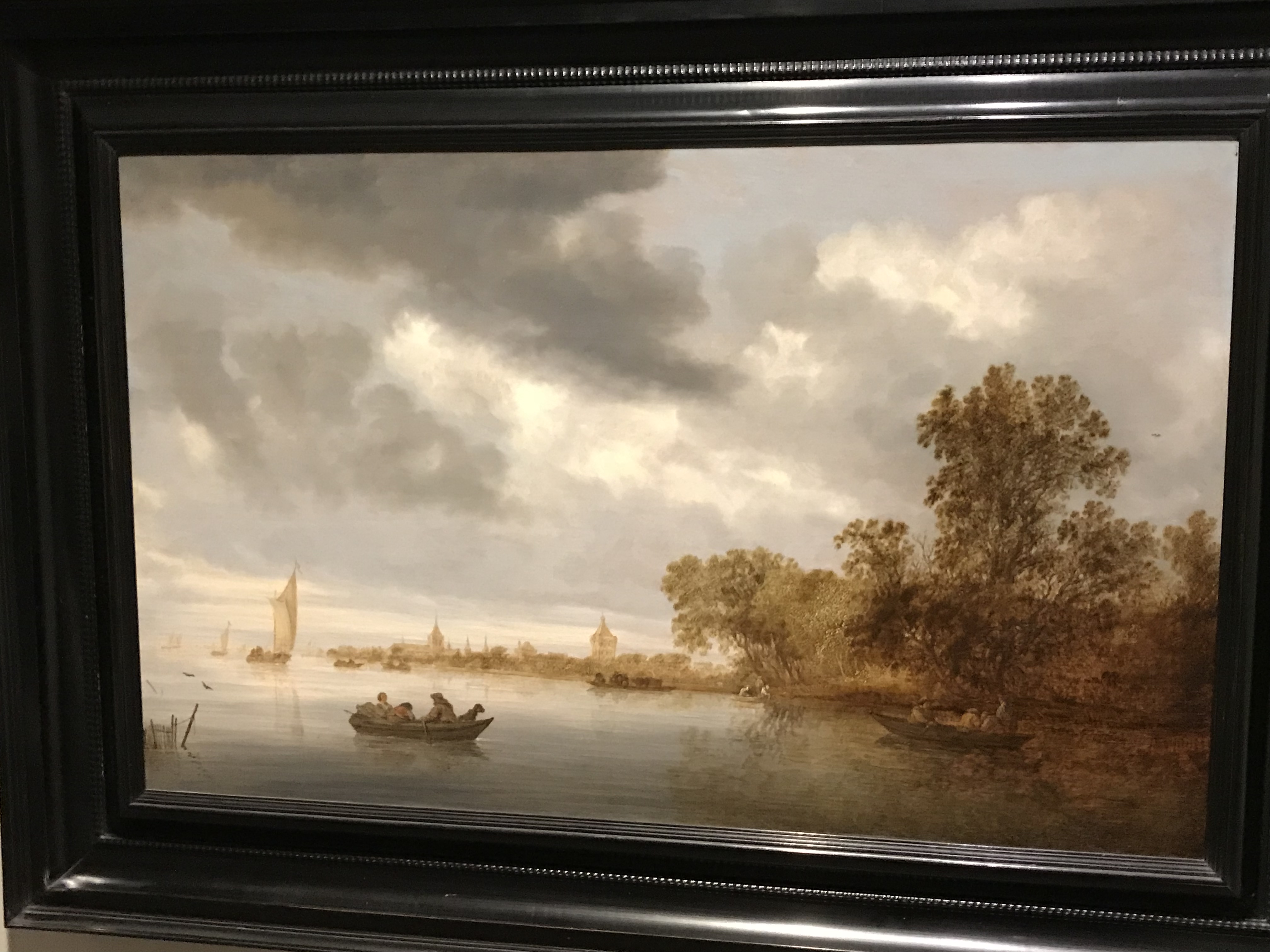
            The Batture Ritual,by Jeff Whetstone, is one piece I saw that, to me, exemplifies the kind of art I don’t typically favor. A calm videoof a river and the surrounding environment is easy on the eyes, but I struggle to place much value on it. Everyone has seen rivers, and maybe it’s a “peaceful” video, but it didn’t make me think or feel anything different that I was thinking or feeling before looking at Mr. Whetstone’s work. To me, a lot of people could produce something like this, and any desired calming effect or appreciation of nature can be found in many aspects of our every-day lives.

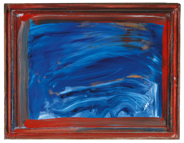
Similarly, Looking At The Sea, by Howard Hodgkin didn’t evoke anything deep from me. If anything, it mainly made me think that I could one day be in the Ackland Art Museum if I took a crack at it. I know that is an arrogant and ignorant statement (while largely a joke), but I simply don’t see the artistic value to wide strokes of blue oil filling up an empty wooden frame. To me, it’s void of real effort, talent, and creativity. Even the big scary spider that popped up on campus this year leaves me thinking more than these two pieces did. Obviously the artist and the people who choose what goes into the Ackland felt differently, but I would love to hear what was stirred within them by a blue square.

I realize that it’s a bit ridiculous that I’m a complete amateur, uneducated in the field being discussed, and yet I sound like the world’s harshest critic. Overall, I enjoy the Ackland Art museum very much and I love most of the work that it has to offer. I also sincerely hope that the artists of the aforementioned pieces never read this, because I have no real problem with their art, and I hope that they continue to produce it if it makes them happy and gets into museums. Perhaps I lack a certain artistic depth that such works appeals to in others. Of course art speaks to everyone differently, and in the end, I suppose that’s one of the many great things about it. I, personally, like to be shocked and awed, but that’s just one man’s opinion.

Ackland Reflection- Trey

Since I wrote my Ackland Art Museum blog mainly on art that I did not like, I decided that it would be nice to discuss the exhibition that I enjoyed most. Color Across Asiacaptivated me in ways that much of modern art does not. I love traveling and visiting historically significant sites and cities. I have had amazing experiences in North and South America, Europe, Australia and surrounding islands, but I have not yet had the pleasure of going anywhere in Asia. Ironically, that is the continent with a richer history than maybe anywhere else in the world.


Color Across Asia allowed me to get up close to some of the kinds of things I would like to go to there to see, and all within walking distance from my small apartment in Chapel Hill, North Carolina. It really is amazing to me what people could do in that day and age with the technology, or lack-there-of, that they had to work with. The fact that all the hand-made ornate clothing and china and tools in the exhibit comes from thousands of years ago is incredible. The talents required to do these things is extremely rare today, if even still in existence, in some cases. To weave gold into a dress and to flawlessly form metals and jewels into artistic pieces and ceremonial garb and jewelry is something that should always been respected and admired, as I do not think we’ll see anything like it again.


Aside from the fact that there are few, if any, people on this earth that possess the skills needed to do this work, many of the natural resources we marvel at in these artifacts have been depleted far from a point that allows use of said resources to be financially possible. To use so much gold and jewels and silk in today’s world would be so expensive that most of us could not afford these items before the cost of labor and everything else is factored in.


Another aspect of this exhibit that I think is worth mentioning is how amazing it is that we are able to recover all these artifacts, and in such pristine condition. Even if slight restorations have to be done, whoever takes care of that did a great job with these pieces. It almost looks as if these ancient materials are brand new. The Ackland Art Museum did a wonderful job of getting this collection in, and I truly felt fortunate to be viewing it all.

Ackland Museum Visit

I have taken a lot of English courses throughout my life, each with their own unique spin, and each with their own unique set of books that I am told to read and examine. While I have been asked to compare novels to things in the past, I acknowledged recently that there are endless interpretations to the way that people can perceive things. One of the most iconic lines in To Kill a Mockingbird is when Atticus says, “you never really understand a person until you consider things from his point of view.” Reading this as a kid was a very important life lesson for me and this quote flashed through my head as we were looking at various pieces of art at the Ackland. I have always been able to acknowledge the presence of different viewpoints and I like to think that I keep an open mind when it comes to people with differing opinions than my own. Seeing the various depictions of art at the Ackland about the same overarching topic illuminated the fact that people can have vastly different viewpoints on things. For example, the first and second paintings that we examined at the Ackland both depicted the fall of man but in completely different ways. The first one we examined was in black and white and had Adam and Eve at the forefront of the image. They were also depicted as the lightest things in the picture which made them really stand out and overall it seemed like a more harsh and serious way of depicting the fall of man… more stereotypically correct. This was drastically different than the second depiction of the fall of man which was in color, only contained Eve, had way more animals, and depicted the tree and the serpent as the main focus. Additionally, Eve was African American in the second painting whereas in the first one she was white.

If someone examined the two paintings side by side, they could quickly glean that they are two vastly different interpretations of Adam and Eve in the Garden of Eden yet they both represent the fall of man. I think this was a perfect way to wrap up the semester as this also applies to the adaptations we have read in class. For example, Robinson Crusoe and the movie “Robinson Crusoe on Mars” both portrayed the same concept, yet they were vastly different interpretations. I think this has a lot to do with audience. Robinson Crusoe was published in the early 18th century and appealed to an audience that was completely different than “Robinson Crusoe on Mars” which was released in 1964. Historical context, location, and time period have a lot do with the way that an audience examines art, literature, film, or the like. The second interpretation of the fall of man, the one with color, was painted by an African-American artist who chose to interpret the fall of man in a completely different way. She chose to focus on the positive aspects of a newly created world by using bright colors and making Eve appear innocent. This greatly contrasts the stereotypical view of the fall of man as Adam, and especially Eve, were seen as corrupt. In the first piece of art Eve acknowledges the serpent holding on to the fruit of knowledge yet she reaches out for it and attempts to take it. In the second piece of art, Eve is seen almost stroking the serpent, as if she is curious and wants to understand more about the animal. She isn’t depicted reaching for the fruit but the animal itself. Visiting the Ackland museum showed me that varying depictions of topics can ultimately display the same thing, just in their own, unique way. I think this is what makes adaptations powerful. It allows the reader/viewer/listener to see something in a completely different light.

Ackland Visit

For my third blog post, I wanted to talk about our visit to the Ackland on the 13th of November. I guess it was only fitting that on one of the rainiest days of the entire semester, we looked at a good deal of paintings that had to do with the sea. The feeling that I associated with two of the items we looked at during the visit, was a sense of serenity. The painting, “River Landscape with Fisherman” from 1643 was very true to its title. In the painting, the water is very still, there are multiple boats on the river. You can see people on these boats, who we can presume are fishermen, there is even a dog seen on one of the boats in the foreground. The sense of calm is further exemplified by the bluish sky and the wispy clouds. We can see a town in the background of the painting and due to its proximity, the town does not look very big. I feel like this what was somewhat purposeful in that it just further denotes the importance of the boats. The purpose of this painting, in my opinio,n is to showcase a moment in history. Based off the context given by the description at the Ackland, this was painted in the 1600s by a Dutch painter that went by the name of Salomon van Ruysdael. In the 1600s, the Dutch were the number one exporters in the world due to the establishment of the Dutch East India Company, which was the world’s most powerful trading company.

The second item that I saw, that kept with this theme of serenity was the video called “The Batture Ritual” by Jeff Whetstone. The part of the film in which I sat through, I got to see a man fishing in the night. The video was filmed in a wide-shot and for that reason the man looked very small amidst a giant sea and the encompassing darkness of the night. The sound in the video was very minimal, as you were able to hear the soft splashing of the water, the horns of the steamboat in the distance, as well as the sounds of insects and birds. There is was no movement in the camera, which once again added to a sense of calm due to lack of action. The interesting thing about the movie, the film wavered between being boring and being somewhat striking. The reflection of the steamboat onto the river was incredibly beautiful, we are shown the interaction between nature and the industrialization of man, and despite what initially I found to be somewhat flat cinematography, turned out to capture on of the most astounding images i’ve seen in a while. Als,o I found a certain choice in the film to seem somewhat Avant-Garde, especially the close-up shot of the fish breathing, it almost looked as if it were suffering, which also made the whole experience feel very grotesque. I only found that to be off-putting and uncomfortable. I really don’t understand the purpose of that shot besides maybe giving the audience a more upfront view of nature, I just found that it disrupted the pre-established tone of the video which was much more tranquil. But there could be an argument of how there is a shift in scale, as bigger objects such as a human being and a steam-boat are given are smaller in scale in respects to the space in which they occupy, and this is shown through the wide-shot. While the close-up on the fish blows up the image of it and there is a sense of claustrophobia. The focus on the fish shows how even the smallest objects, such a fish, can have great weight if shown in a certain style or perspective. There was more gravity to the shot of the fish than anything else in the film, so maybe this is trying to show the significance of focus in media and the power that it possesses.

In the Ackland Visit, I was not initially impressed by the paintings that were associated with rivers/water but as I attempted to delve deeper into their purpose and what significance that they possess, I found myself asking questions about the feelings that the painting gave me and the reasons for they exist in the first place. Sure there is a commonality in that both these pieces were calming to me for the most part. In contrast to the item we saw, which was called “Looking at the Sea” which was much more abstract and gave me this feeling of chaos. This is painting that I personally didn’t see very much purpose to and it left an unwanted pretentious taste in my mouth, because of how abstract the message of the painting was. Maybe, it just wanted to emulate the chaotic nature of the ocean or maybe it delves deeper than that. Yet, I digress, I guess the two works of art that I talked about prior both showcased the beauty that exists in the interaction between humans and nature. Both works exemplify tranquility and an appreciation for nature and its gifts.

An Ocean of Style

I honestly enjoyed the visit to the Ackland Art Museum, and I feel like it was very important to the pacing of the class as a whole. My girlfriend is an art education major at UNCG, and I’ve taken a few art classes at high school, so I have a considerable appreciation for the effort that goes into creating professional pieces of art. Looking at adaptation through art was rather refreshing because so far our interpretation of adaptation had been primarily framed by written literature, which can feel like a slog sometimes. While I don’t necessarily think we had enough time to fully look at the pieces, it was still very helpful nonetheless in understanding the cultural and stylistic influences that go into adapting a work of art or literature. This was especially true when comparing Albrecht Dürer’s Fall of Man to Rose Piper’s Eve and the Serpent. Although I’ll admit, it is impossible to gauge how much time is “enough” to understand a work of art. It’s not like it has page numbers or anything to indicate when you are “finished.” Nevertheless, every piece we observed was bursting with meaning. Personally, I found the most interesting piece to be Howard Hodgkin’s Looking at the Sea. If you’ve ever seen a painting be taken from its frame and re-varnished, you’ll quickly notice that upkeep on this painting is probably a nightmare, as the frame itself is painted over and is part of the piece itself. The “canvas” (which is actually just oil paint on wood) bleeds all over and into the frame, running amok and without regard for its own preservation. Its disorganization is a direct emotional parallel to how the briny depths care nothing for those who pass over its surface. It is indifferent to all things, even itself. The paint on the frame looks like it has begun to chip over time from being moved to and from resting places. Brilliantly, it captures the viscosity and momentum behind the ocean, as it washes all over the picture frame. Not only that, but it shows how delicate humanity should be with the sea, as there are no second chances when it comes to framing the painting nor are there when handling the health of the ocean. Other than that, it is a hilariously irate painting when compared to Salomon van Ruysdael’s quaint River Landscape with Fisherman painting. Largely these pieces just go to show how much the meaning and feeling an image as simple as that of a body of water can vary through artistic style. It makes it all the more mind-blowing to think of how much writers can do with extremely complex concepts like a Robinsonia or a ‘Frankenstein’ style monster.

Ackland Paintings

The Ackland Art Museum located in Chapel Hill, North Carolina is filled with a wide variety of paintings and works of art that are rich in culture and history. Along with the original intent of the artist when they created their artwork, much of the paintings are open to interpretation by the person viewing it, which is one of the qualities of art that makes it appealing.

The first painting that we looked at was Solomon van Ruysdael’s River Landscape with Fishermen. This painting depicts the landscape of a very serene river with small boats and a town in the background. Overall, this represents the very simple lifestyle that the Dutch people partook in during the 17th century, as trade and other economic activities started to be on the rise. At that time there was a large separation between the wealthy and the poor so this is probably what it would be like for the less economically stable group.  A good portion of the painting also has dark clouds pushing out the nice white ones. Although there is no way of knowing Ruysdael’s true intention when he painted those clouds, this could be his way of foreboding troubles that may be occurring in the near future as a result of these new economic activities of the Dutch. Another aspect of this painting that stood out to me is that no one is in the canoe alone. Even if these people don’t seem to have much, they have other people around them that can make a hard days of work a little easier.


The second painting we looked at was Howard Hodgkin’s Looking at the Sea. One of the biggest differences between this painting and the one that was previously looked at, is that this one is more abstract; therefore, it is open to much more interpretation. The brushstrokes and the varying shades of blue make the painting look very chaotic, but the small slivers of gold paint highlight the beauty in all the messiness. The red/orange paint along the edge of the painting make the waves and sea seem more powerful and sort of aggressive. This painting definitely brings the sea to life by giving it a personality. At some parts, like the top of the painting, the sea seems very calm and approachable, while at other parts, like the bottom corner, it seems full of drive and anger.

The first two paintings that we looked at fit into the book of Robinson Crusoe by relating to the idea of the sea. Crusoe was so fascinated with the sea that he willingly threw away his previous life to travel and explore it with no real intention in mind. While one painting is more abstract, the other one clearly shows a real-life scene. I think that these paintings capture the juxtaposition that was consistent throughout Crusoe’s time on the island. At certain moments he was at peace and knew exactly what he was doing on the island, while at other times, it was total chaos in his mind. In the book, there were times when it was almost as if Crusoe had come to accept the island as his new home and the fact that he would probably be lonely for the rest of his life. In contrast, there were other times when he longed for a companion and thought about building a canoe and venturing outside the confines of his island. In a similar fashion, the people in the first painting seem to be okay with their way of life. They seem content with the simple lifestyle they have and don’t appear to be worried about the future. On the other hand, the more abstract painting captures the more adventurous side of Robinson Crusoe who has the motivation and drive to go out and change his condition, even though he doesn’t really take action until other people stumble upon his island and in a way forces him to.


Third Blog Post: Ackland Visit

Before our tour of the Ackland Art Museum it wasn’t clear to me what an english class could learn from looking at artwork. However, my group had a wonderful tour guide who provided insight into how the concept of adaptation can be applied to paintings. The two most memorable paintings for me were Looking at the Sea and Eve and the Serpent.

Looking at the Sea is an abstract painting, and initially I did not realize that it could be depicting the ocean. When I first saw this painting I thought it looked like someone had tossed a stone into a pond. I also thought the streaks of tan and orange in the upper corner was a reflection of objects on the pond’s shore. Once our tour guide explained that the artist’s title indicates it could be seen as the unruly sea I saw the painting in a different light. Suddenly the swirls of blue at the bottom of the canvas looked like waves in the ocean, and my mind was immediately taken back to the story of Robinson Crusoe attempting to sail in the storm. This experience caused me to reflect on the term adaptation in regards to abstract paintings. Since abstract art does not directly depict an image the meaning of the work can be interpreted by the viewer. If I was viewing this painting alone I might have never considered the painting to look like the sea if I didn’t read the title Looking at the Sea. If an adaptation reframes a work would different interpretations of what is shown in abstract art be considered the beginnings of adaptation?

Our group looked at Eve and the Serpent after viewing another painting that depicted the story of Adam and Eve. I thought this painting was an intriguing adaptation of the biblical story and the bright colors captured my attention. At first I was unsure about the author’s motivation for choosing to paint Eve as an African American, but our tour guide addressed this concept by explaining that the painting’s title references the slave song “Dem Bones”. Once I knew about the slave spiritual I could see that this adaption reframed the story of Adam and Eve to reference the ideals of social injustice and slavery. Perhaps Rose Piper’s choice of not including Adam in this painting also represents a message about oppression, but instead focuses on the oppression of women, not just African Americans. Adam’s absence could represent the strong independence of women from the oppression of men. Overall I thought the trip to the Ackland was very insightful and helped me realize how a painting, without the supplementary details movies and books provide, can be an adaptation that sends a unique and detailed message from its creator about the source referenced or societal ideals.

Eve and the Serpent

                                                                              Rose Piper, 1988

The story of creation and the fall of man are two of the most recognizable stories told. In contrast to the biblical representation of Eve as a sinful woman who leads man into temptation, Rose Piper’s Eve and the Serpent painting portrays Eve as innocent and naive. In the center of the painting, Piper illustrates Eve looking intently at the serpent on the tree her eyes filled with wonderment and fascination. However, the serpent is winking while facing the viewer. It is almost as if it is showing the audience that we know something that Eve does not, emphasizing her naivety. Through Piper’s vision, Eve is not the one to blame for the fall of man she is a victim of the serpent’s master manipulation. Piper changed the story from “The woman you put here with me—she gave me some fruit from the tree” (Genesis 3:12) and “Because you listened to your wife… Cursed is the ground…” (Genesis 3:17) to “The serpent deceived me” (Genesis 3:13). The serpent is painted a vibrant blue color surrounded by a contrast of bright red fruit. Red is often depicted as a sinful color affiliated with anger and passion while blue is often associated with calmness and tranquility. The snake purposefully lured Eve into a false sense of security. The serpent’s wink in the painting elucidated that he is up to something. Us, the viewers who have heard the story before, know that he manipulates Eve into eating the forbidden fruit from the tree of life.

Whitewashing in Christian Motifs – Jillian Ward

Christianity is known for whitewashing all types of Christian motifs: angels are always pale-faced, and Jesus himself was portrayed as significantly paler in skin color than he was known to be from his life. Most depictions of Adam and Eve, too, are white. This, of course, stems from the deep, racist history of Christianity across the world; evangelicals would travel to tribe-owned lands where people of color lived in peace to push their religion on them, often inciting violence as a means of coercion. The belief was that people of color were less “cultured,” and thus, they needed to be taught by white people how to be human. This implies a belief that white people were better than people of color — more intelligent, and more human than them, too. However, a piece currently residing at the Ackland depicts one of the most famous Biblical stories, Adam and Eve, through a black lens; Eve is a woman of color, and the painting itself represents one of the songs sung by people of color centuries ago. In that song, the serpent of the tale “wink’d his eye,” and in the painting, he does, too. Subverting the typical whitewashing and white assumptions of Christian motifs in this way forces us to question why depictions of Christian stories have always involved whites and not blacks, and it gets us to evaluate the cultural history behind Christianity and its impact on people of color through time.

Trip to the Ackland Museum and Adaptaion

I thoroughly enjoyed my trip to the Ackland Museum of Art and was able to see how mediums, besides novels, can be examples of adaptations and intertextuality. Some of the works that stood out to me in this context, were the depictions of Adam and Eve in The Garden of Eden. Looking at the different aspects of the paintings such as colors, settings, objects and the size of objects, we can gather what the message of the creator was. In the first depiction, there were trees, animals, a woman, a man, and a snake. They were barely clothed and it was easy to recognize the story that the creator was trying to recreate. These items were copied in the second depiction but there were certain nuances that helped to change the story in a drastic way. The main difference was that there was not a man in the second painting. This may change the meaning of the story but the important part is that the story itself is still recognizable. Why the painter did not include a man in the second painting is up to interpretation; some say that it highlights the fall of the woman by only including her in a story that is about the fall of mankind. This is an example of why I believe that artwork, namely paintings in this circumstance, are harder to interpret than novels. The volume of information, in my opinion, is just greater for written works. One explanation as to why I hold this opinion could be a simple fact that I am not trained to evaluate art. I do not have that much experience when it comes to art and therefore I am probably missing key details such as brush strokes, the type of paint used, the timing of the paint, etc.

Since this course is about adaptation, I feel as if I must address the ambiguities that come along with the term. An adaptation is a composition that reframes or modifies another work. The reason that I believe the definition of an adaptation is ambiguous is because it is extremely difficult to create something completely original. In fact, everything has an origin and takes themes from someplace else, even if the author unknowingly did it. Frankenstein in Baghdad would be considered an easy adaptation to identify, but if the title was different, there would be an argument to be made that it’s an original work. The theme of somebody putting body parts together and causing it to come to life is broad enough to not warrant an intellectual patent.